In early 2015 I had the opportunity to create my own team from the ground up to design Microsoft Office’s latest productivity software: Microsoft Teams. During the span of one year, my team of 10 designers explored the concept of a chat based collaboration platform which leveraged Microsoft Office 365 and Skype. As Principal Design Manager (reporting directly to the CVP) I led the Microsoft Teams design team and was responsible for information architecture, UX framework, visual direction, and design strategy for the application.
Early Concepts
Our initial explorations focused on the basic layout for the app. We explored several visual styles and layout configurations. During the early phase of the design, we favored a tri-pane design with navigation on the left, conversations in the middle, and contextual information on the right.
Milestone 1 - Channels
One of the biggest challenges we had to solve was threaded conversations. We wanted to make sure that the context for a reply was not lost. The challenge was making it still feel like chat and not like the user was composing an email.
Milestone 1 - Files
As part of Microsoft Office, we wanted to make files an integral part of the experience. The ability to quickly access your latest files without needing to hunt for them could mean a significant boost in productivity. The tabbed channel design allowed us to extend the channel beyond conversations. In this example, we explored how files could look with a Microsoft Delve like view.
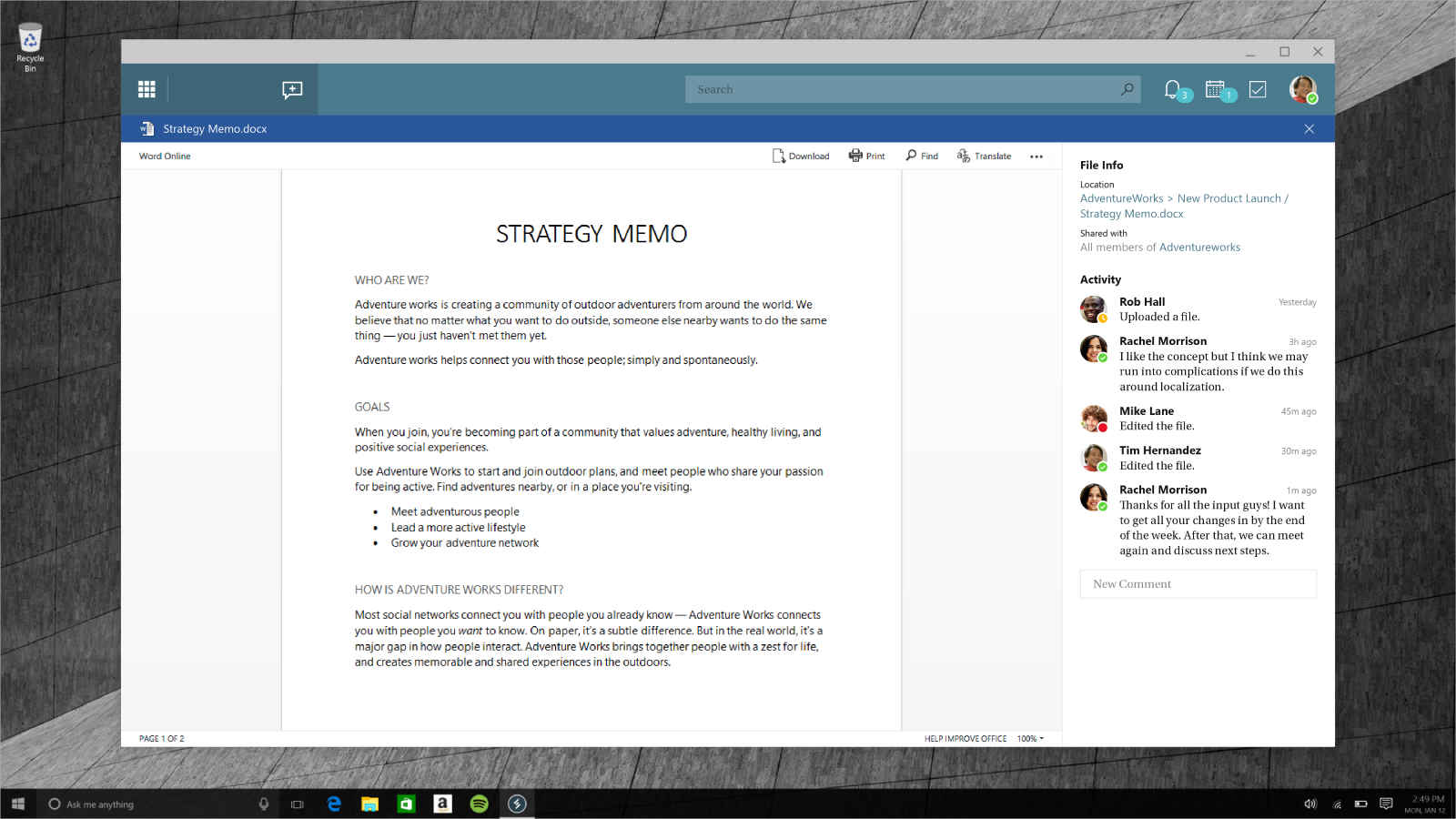
Milestone 1 - Office Integration
With Microsoft Teams, we wanted to give the user the feeling that they never needed to leave the application to complete their tasks. Deep integration with Microsoft Office allowed us to open Office files within the experience. From the design perspective, while in immersive mode we decided to remove any unnecessary app chrome so the user’s focus could be on the document.
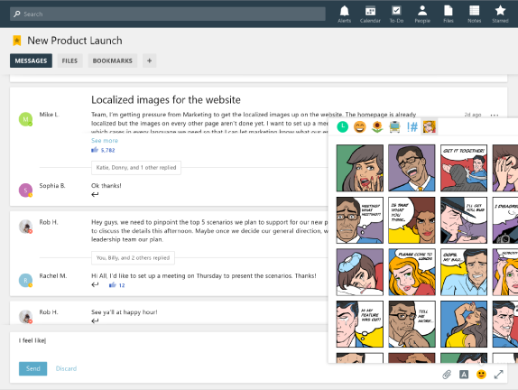
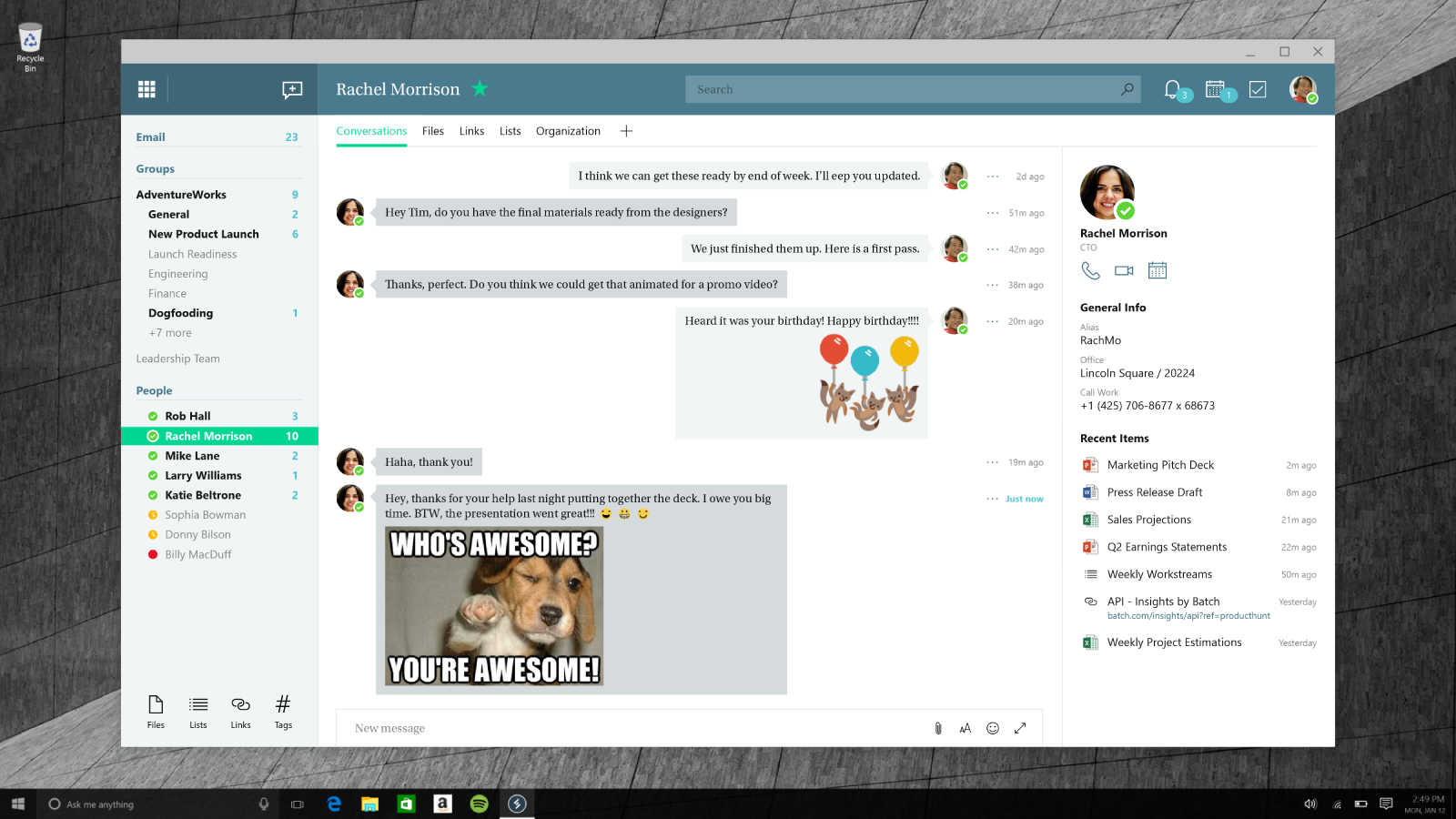
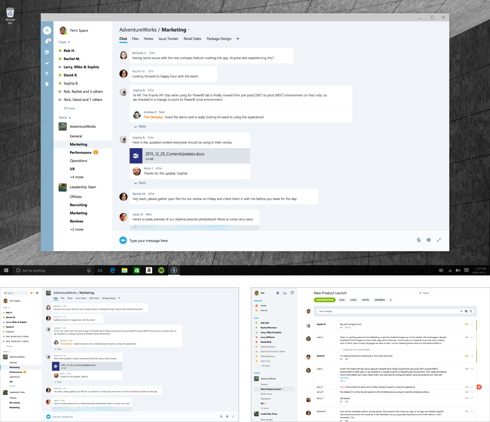
Milestone 1 - Chat
Collaboration is all about people. We wanted to make sure we had great 1:1 chat, so we leveraged Skype as our baseline experience. We incorporated Skype’s great chat and video capabilities into Microsoft Teams. In addition, we augmented the baseline Skype experience with richer message formatting, contextual information, and fun elements like meme generators, stickers, and Giphy.
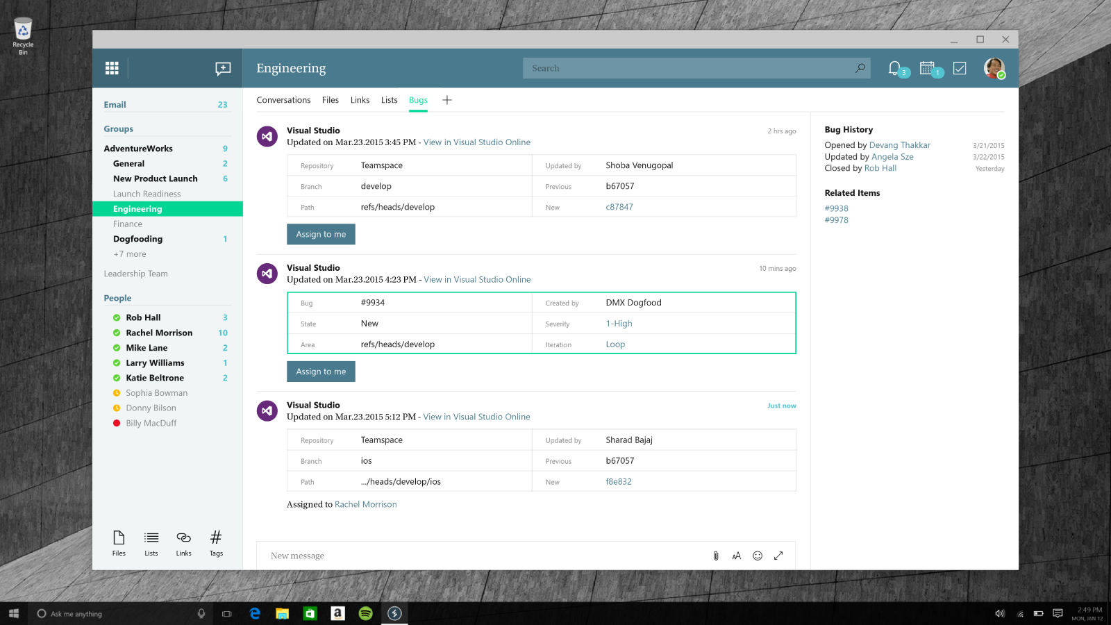
Milestone 1 - Extensions
A major part of creating a platform is providing the ability for partners and 3rd parties to extend your application. Microsoft Team was designed with that in mind. From the very beginning we thought of ways in which others could add to the richness of the application. This example shows how the user could create a tab within a channel to track bugs using Visual Studio Online.
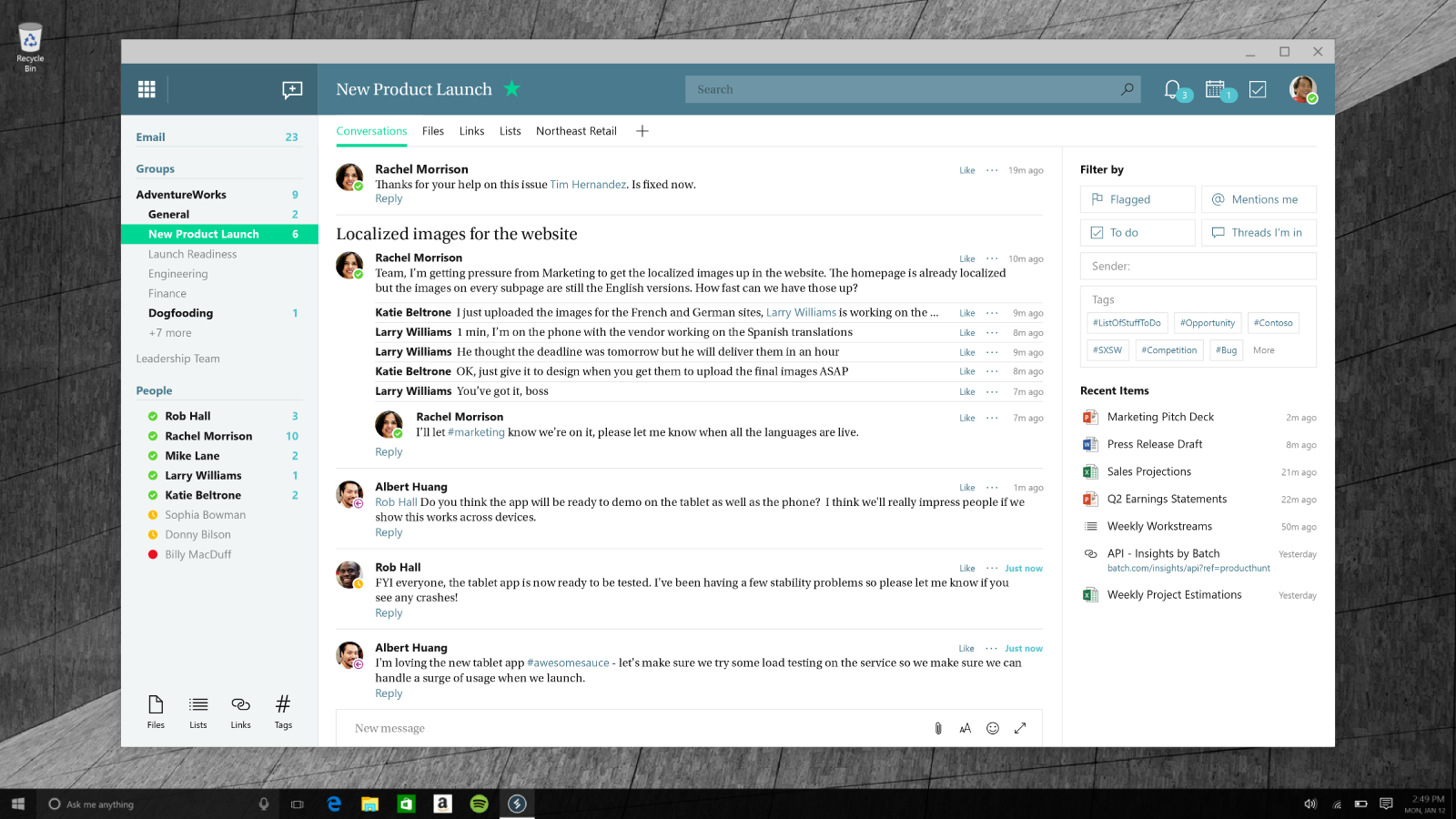
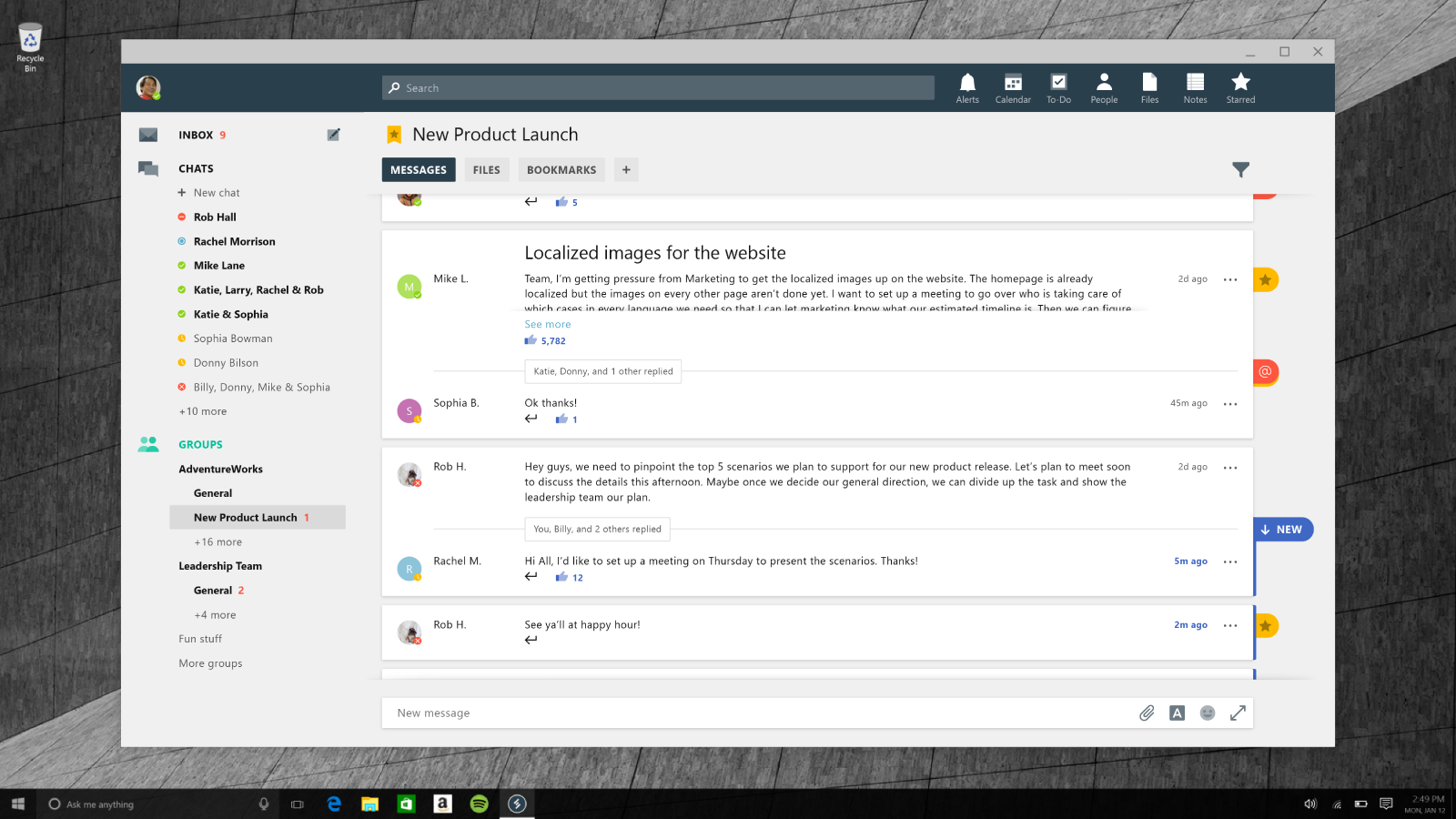
Milestone 2 - Channels
As the product evolved, we started to think of new ideas to make the application less cluttered and help the user focus on what is important to them. Three main changes were made to the conversation view on Milestone 2: we removed the right most pane, we started to collapse threads, and we introduced mention and star badges so it was easy to scan which conversations were the most important.
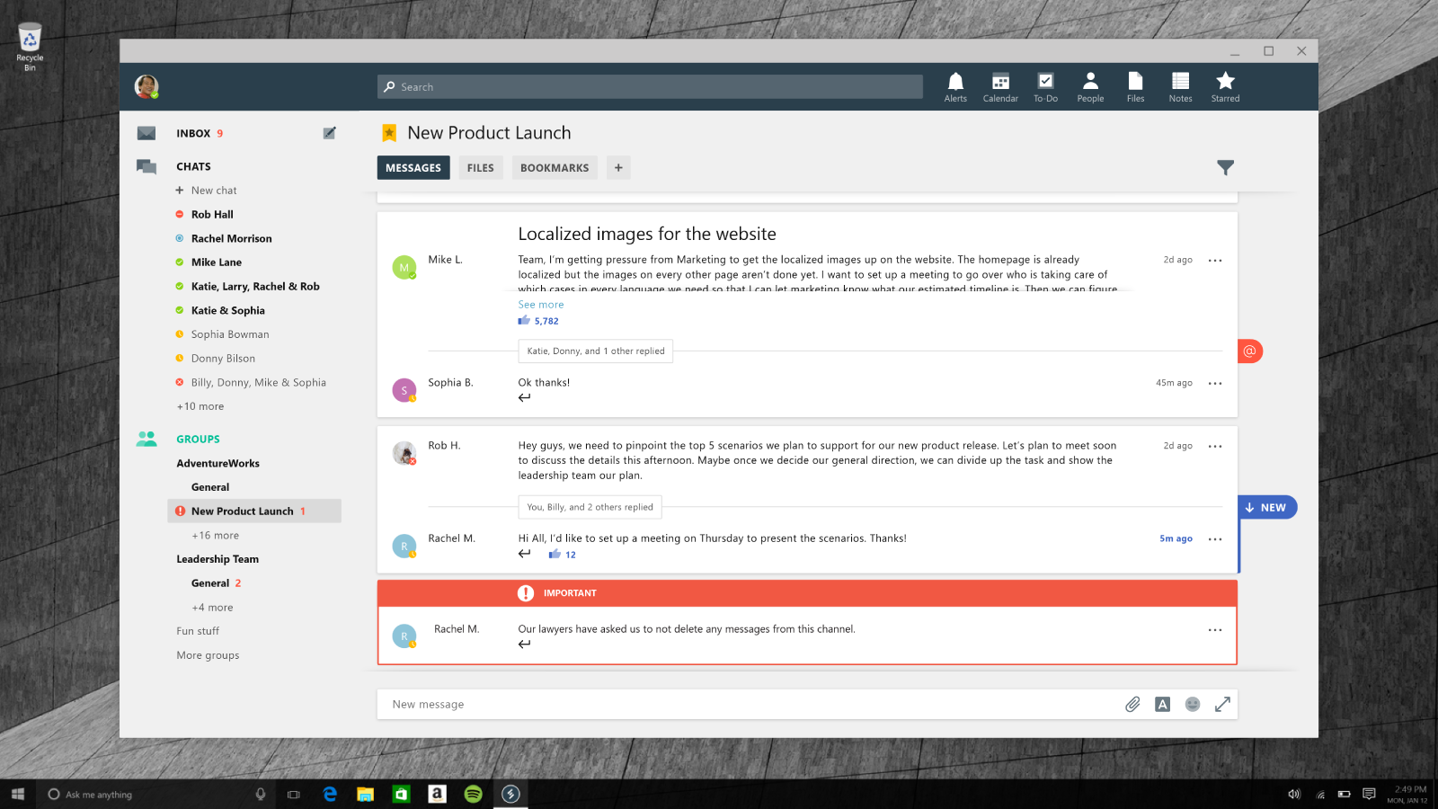
Milestone 2 - Important
On Milestone 2, we introduced the idea of important messages. We wanted the ability to distinguish important messages from generic everyday messages. Important messages, with their unique styling, can indicate importance to everyone even when they are not @mentioned or if they joined the channel after the message was sent.
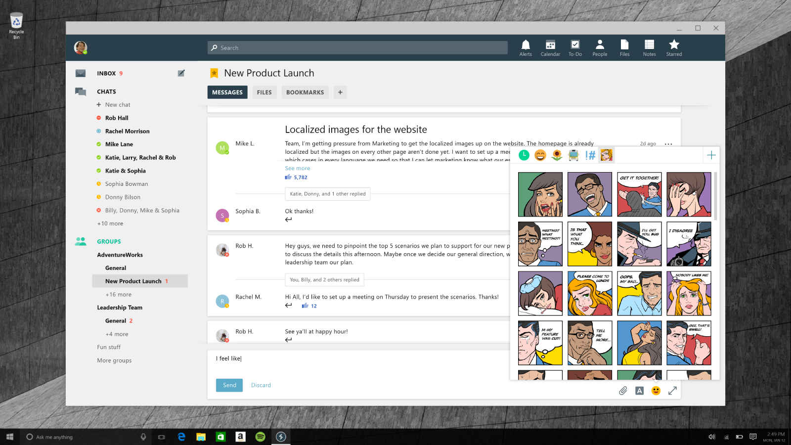
Milestone 2 - Fun
The way we communicate has changed in recent history. The emoji is ubiquitous in text messages and chat users desire the ability to be more expressive and emotional in their conversations. We created a menu in the composed bar which we referred to as the “fun menu”. In it, we added meme generators, colorful stickers, emoji, Giphy and other tools for the user to fully express themselves and generate a few laughs within their team.
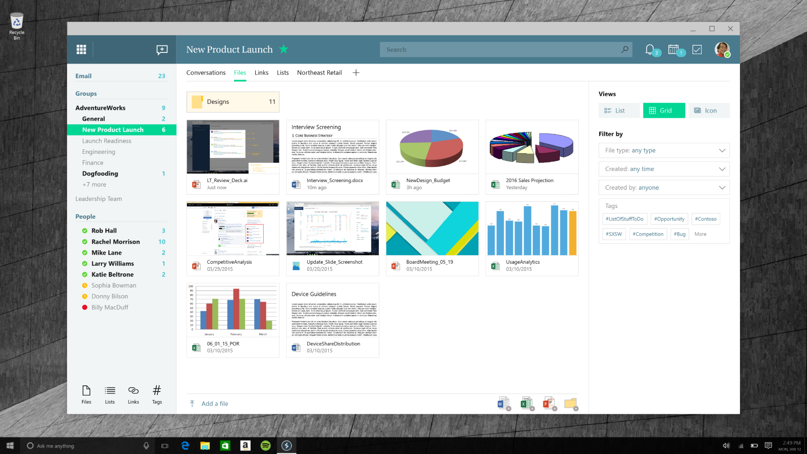
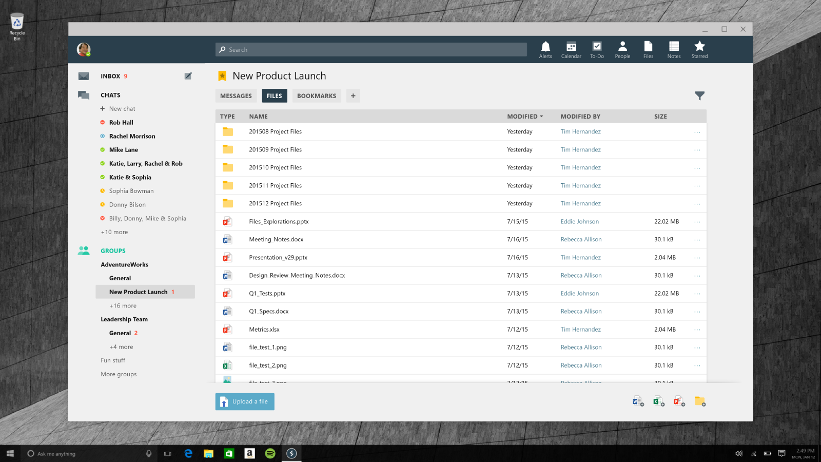
Milestone 2 - Files
We kept refining how we represented files on Milestone 2. Based on feedback from our users, we decided to favor a list over a grid with previews. Previews as a concept sounds great, but in practice very few files (except pictures and movies) offer useful previews and it is more important to be able to distinguish between file types. In addition, the list view offered us more density and more meta data which the grid view lacked.
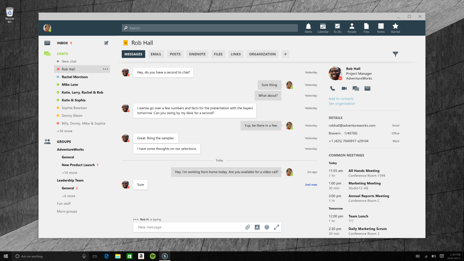
Milestone 2 - Chat
1:1 chat went unchanged on Milestone 2. The design team did invest in ways to make the person-to-person channel richer and more meaningful. New tab ideas such as the ability to see all of a person’s team posts were introduced.
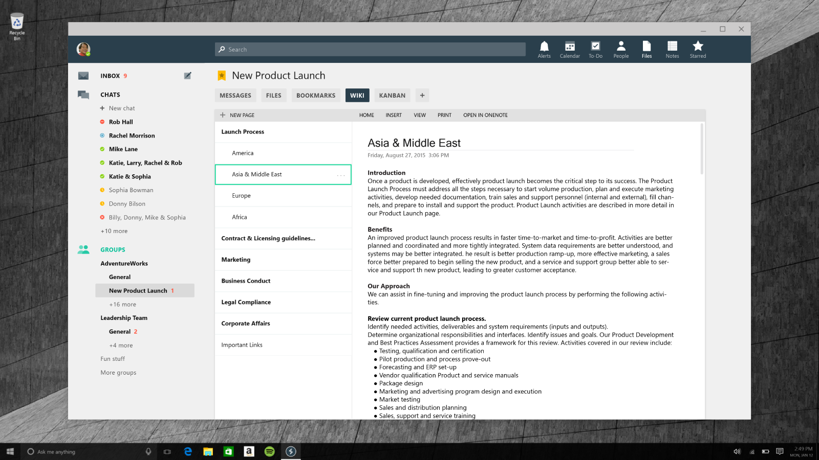
Milestone 2 - Notes
We explored more ways to incorporate the best parts of Microsoft’s ecosystem in a seamless way. This example brings OneNote into a channel, providing a great canvas for note taking, structured information sharing, or even a wiki.
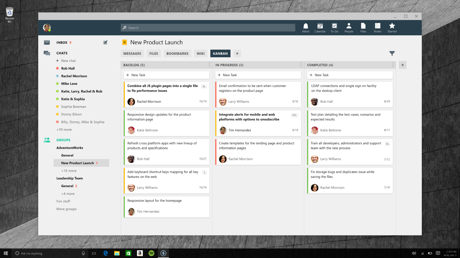
Milestone 2 - Kanban Board
Teams needing the ability to get organized and track tasks can do it directly from Microsoft Teams. With the built-in Kanban board, we wanted to achieve a design which was very simple and reduced the friction of learning new software for this purpose.
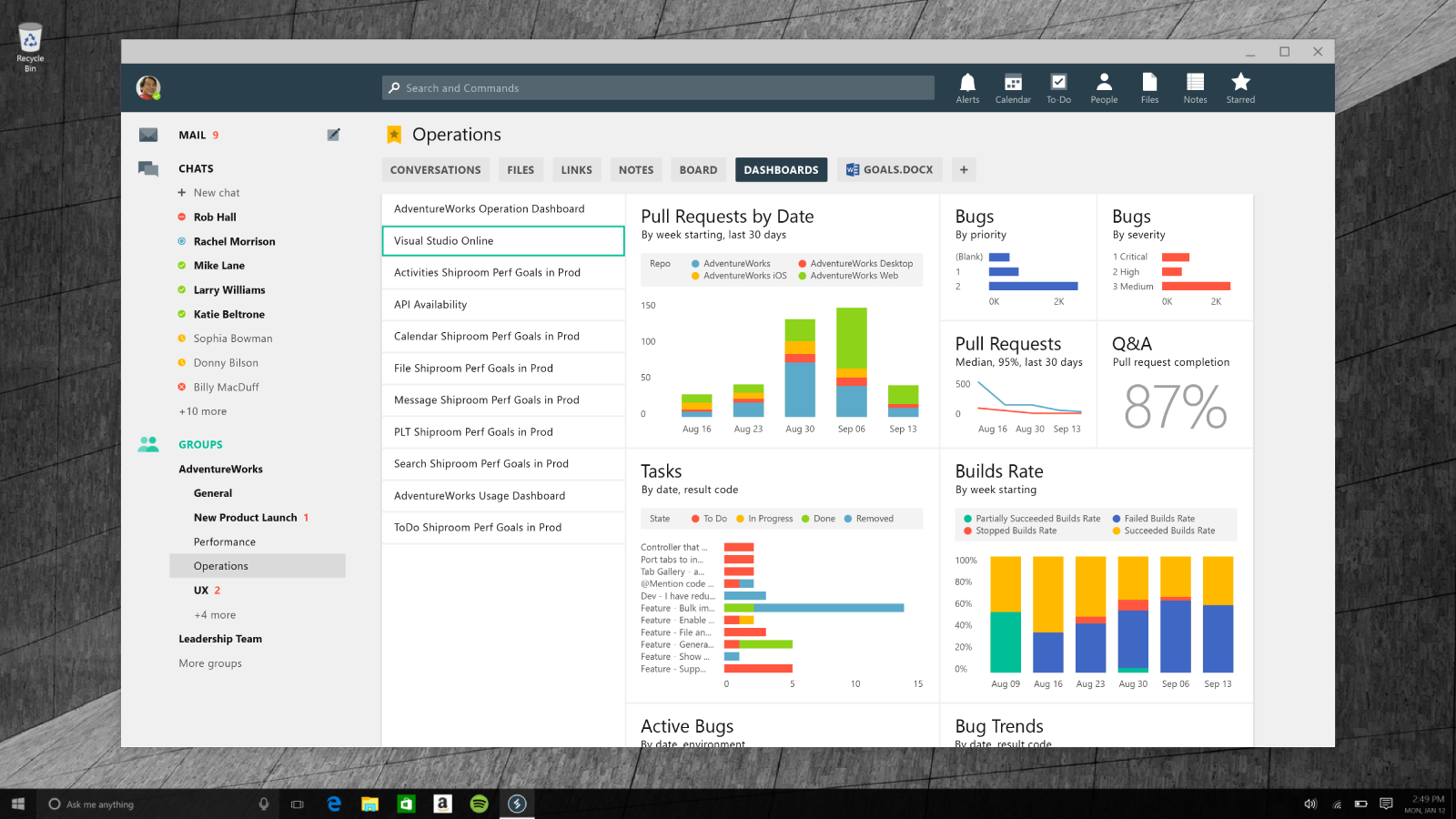
Milestone 2 - PowerBI
Across the Enterprise market, there is a big investment in tracking and analyzing data. With Microsoft PowerBI, companies can create dashboards to visualize and consume massive amounts of data in a visually aesthetic way. We built that directly into Microsoft Teams, so navigating to the dashboard could be as easy as clicking another tab with no need for extra URLs.
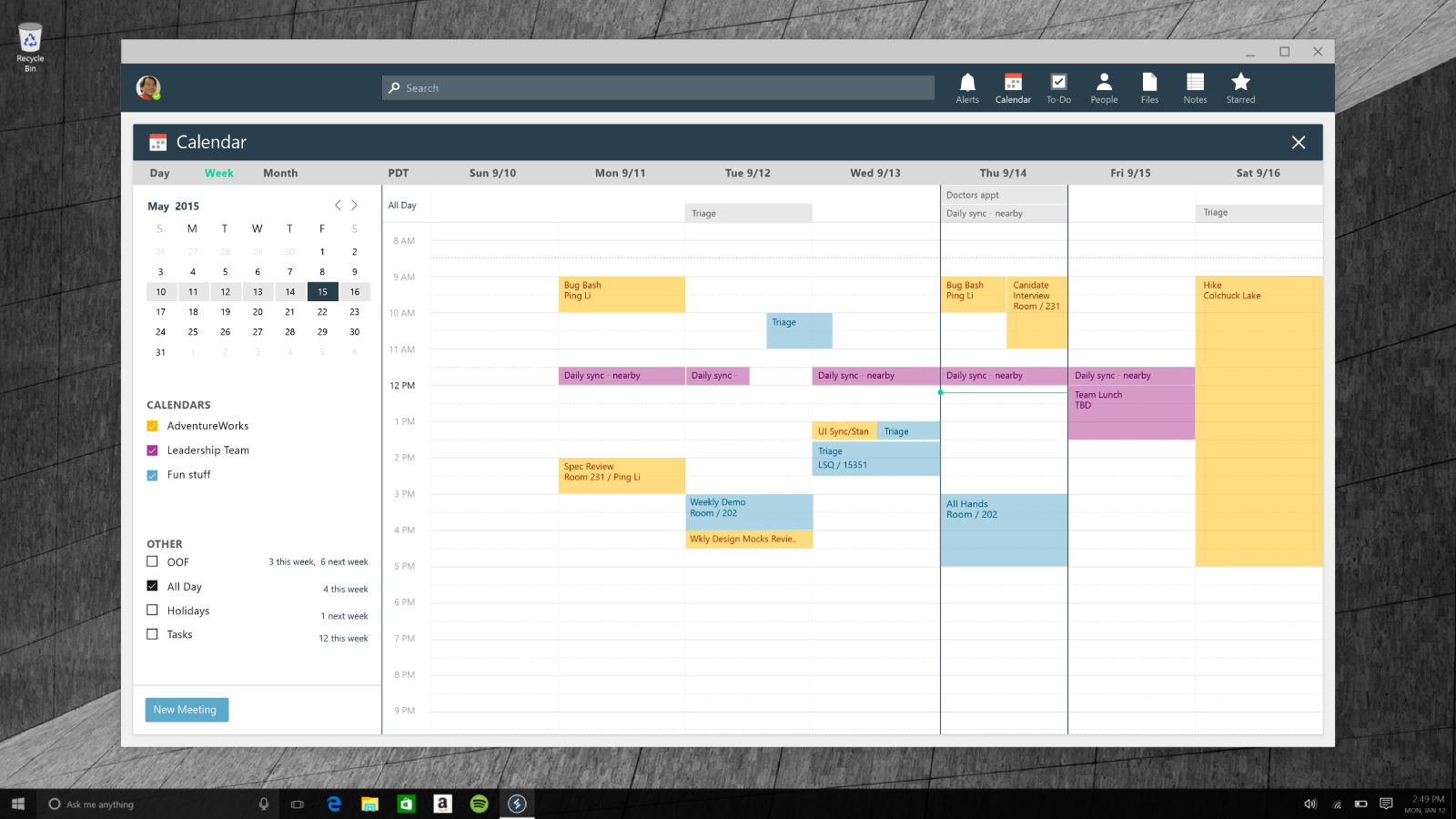
Milestone 2 - Calendar
In the early phases of the project, we felt that a full calendar was necessary for the collaboration platform to be complete. To accomplish that, we leveraged learnings and designs from Microsoft Outlook and Sunrise to provide a robust yet simple calendar experience.
Refinements
Post Milestone 2, the product kept evolving and getting more polished. We tried to eliminate chrome distractions and provide the user with only the tools and visual affordances they absolutely need. The color also went through several explorations with the desire to make the app feel lighter and more open. The major goal was to reduce complexity and achieve a less overwhelming visual look.
Design contributors: Chad Voss, Gilbert Irias, Eric Sexauer, Ping Li, Tony Yates, Katrina Mendoza, Charlotte Tang, Sagar Shastry, Albert Yih, Sariah Swick, Riley Frambes